01 · Treemap
The biggest category took over the chart
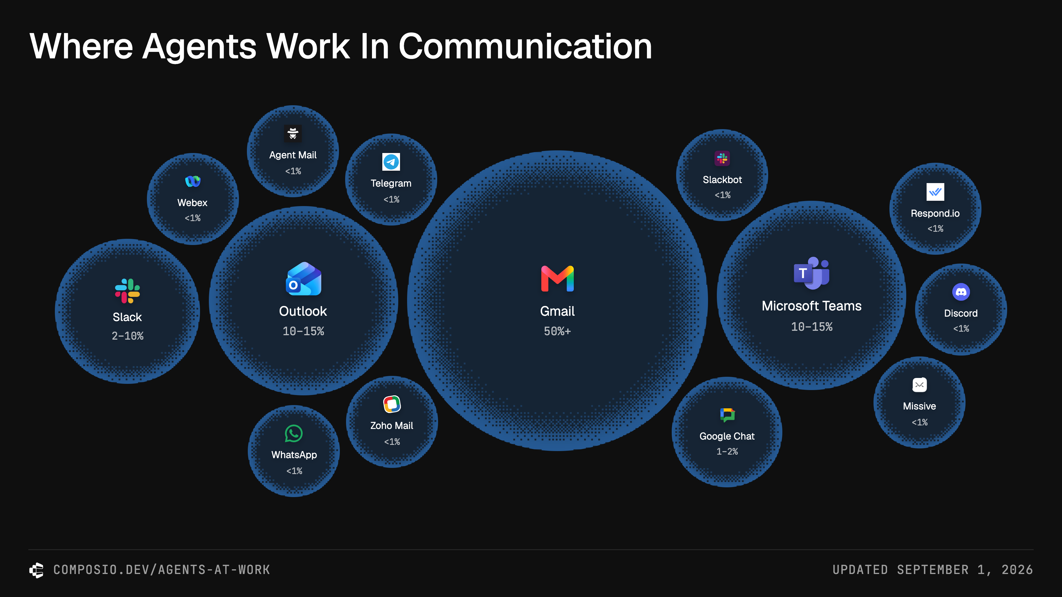
I started by sizing each category in proportion to its activity. Communication filled roughly half the treemap. That made its dominance obvious, but left the smaller categories crowded into tiny blocks.
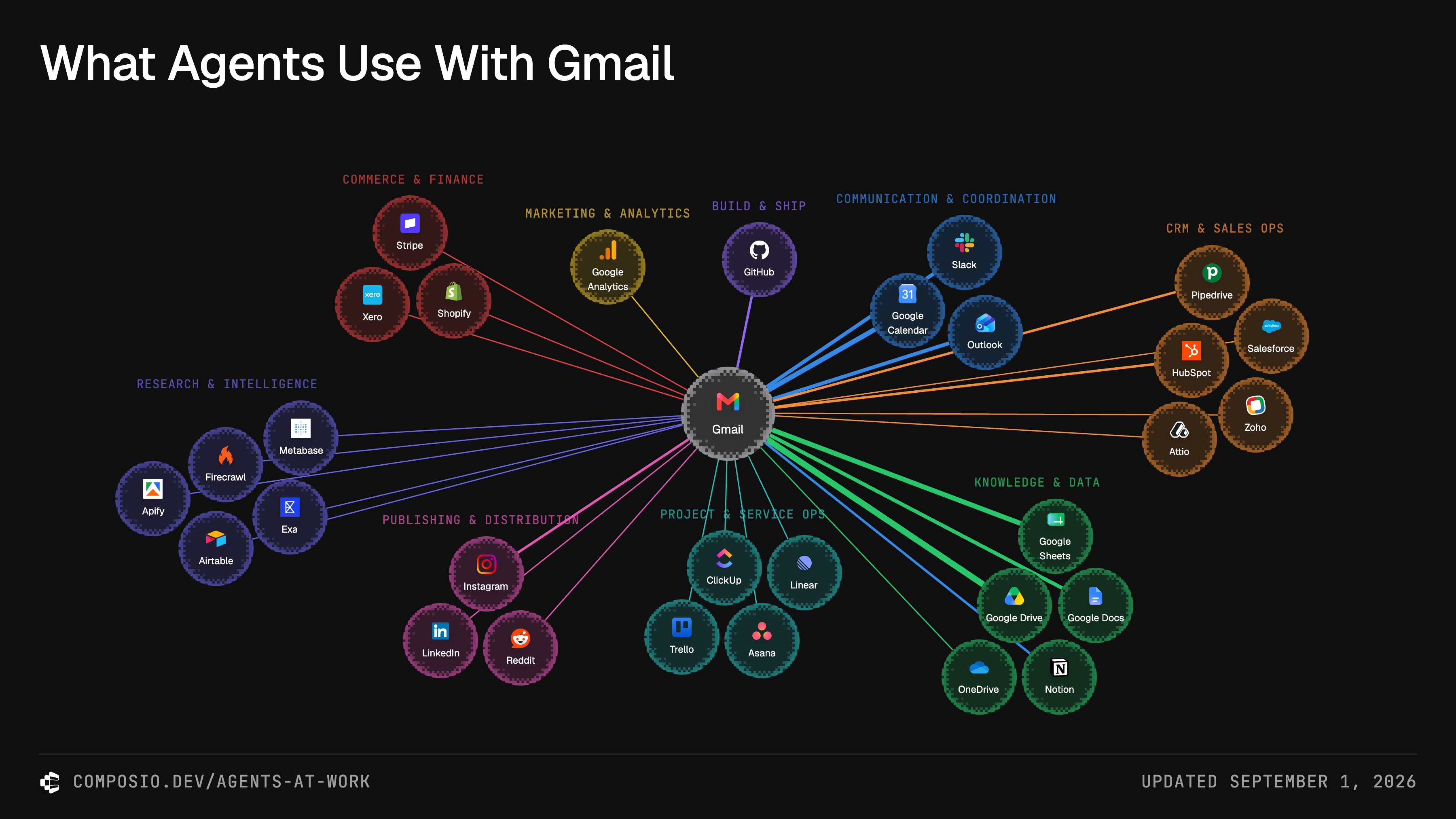
The apps were another level down: selecting a block opened a ranked list beneath the chart. The view showed where most of the work happened, but gave much less room to everything else.
Loading the earlier version…
Select a category to see its apps. On phones, this version used a row of category selectors.